Guides for Program Administrators
- Logging in
- Edit Profile
- Navigating and Understanding the CBME Program Dashboard
- *New* Visual Summary Guide
- Adding a URL to your CBME Dashboard
- Viewing a Learner’s CBME Dashboard
- A Primer on EPA Versioning
- Indicating a Learner has Completed a Stage/EPA
- Viewing a Learner’s Assessments
- Resetting EPA Assessment Expiry Dates
- Creating Groups
- Toggling Roles to Change Access
- Understanding and Using the Assessment Data Extract
- How to Log a Meeting
- Mobile Device Setup
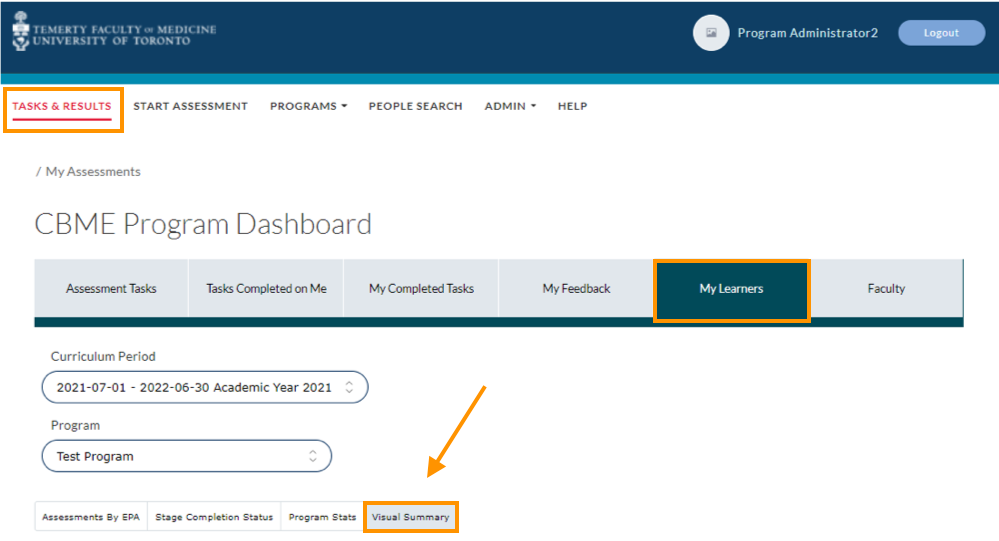
Use the following steps to access the “Visual Summary” tab.
- First login to Elentra and you land on the “Tasks and Results” page.
- Click on the “My Learners” tab.
- Then click on the “Visual Summary” tab under the data filters.
The Resident Metrics Dashboard focuses on individual residents and is designed to be used by Competency Committee members whereas the Normative Assessment Dashboard shows the performance of all residents in a program relative to each other and their training phases and is meant to be only viewed by Competency Committee members.
Users can switch between the two dashboards by using the tabs at the top which highlight the name of the current dashboard being viewed. Users can also switch the program being currently viewed in the dashboard by using the dropdown above the dashboards if they have access to multiple programs.
Normative Dashboard
The normative dashboard presents summarized data metrics of all the residents in a program relative to each other. The data is presented as both a visual representation (left) and a tabular representation (right).
Users are provided with an option to either view all the residents in a program or selectively view the metrics of residents in one particular training stage (Transition to Discipline, Foundations of Discipline, etc) by using the dropdown at the top of the dashboard. This can be useful during Competency Committee meetings when residents are judged on their performance relative to others in their particular training group.
By default, the normative dashboard filters out residents without any completed EPAs. However, this behavior can be turned off by toggling the checkbox at the top of the dashboard.
The bar chart visualizes the following four metrics individually and to switch between the metric being visualized, users can select the corresponding radio buttons above the chart. Each bar represents one resident and users can hover their mouse over a bar in the chart to see the name of the resident it represents, and the value of the current metric being shown. Clicking on a bar in the bar chart switches the user to the resident dashboard to view a detailed breakdown of all assessments of that particular resident.
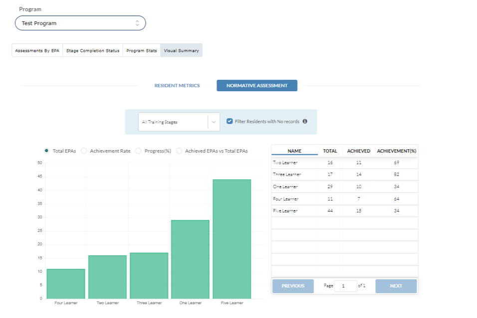
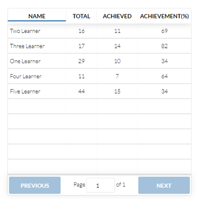
Finally, there is a tabular representation of the same metrics with the ability to sort the residents in the table by clicking on the column header. By default, the residents are sorted in the table by name in a descending order. This can be changed to an ascending order by simply clicking on the column header “Name”. Similarly, clicking on each column header sorts the table in an ascending order based on that particular metric and clicking the same column header again changes the order to descending.
The normative dashboard is linked to the resident dashboard so to view a particular residents assessments in detail users can simply click on a bar corresponding to a resident in the bar chart or their corresponding row in the table. This will automatically switch the user to the resident dashboard with that particular resident preselected
Resident Dashboard
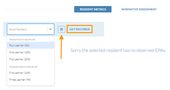
The resident dashboard has a wealth of information that is grouped into different categories for easier comprehension. First if you arrived at the resident dashboard by selecting a resident on the normative dashboard their data is automatically fetched for you. However, if you manually switched over to the resident dashboard by clicking on the navigation tabs above, you will need to select a resident from the dropdown in the filter panel situated at the top of the dashboard.
The dropdown contains the list of all the residents in the program with their name and their corresponding progress rate. The list of residents is further grouped by their training stage and then sorted alphabetically for easier access.
The dropdown is also an editable text box and so you can type a residents name partially to automatically filter the available options in the dropdown. After selecting a resident, users can then click on the “GET RECORDS” button to visualize their assessment data. You might notice the small button with the calendar icon on it. This is used to highlight assessment data gained by the resident in a particular time period. This is talked about again later in this guide.
The resident dashboard consists of 4 main sub sections.
1. Acquisition Metrics
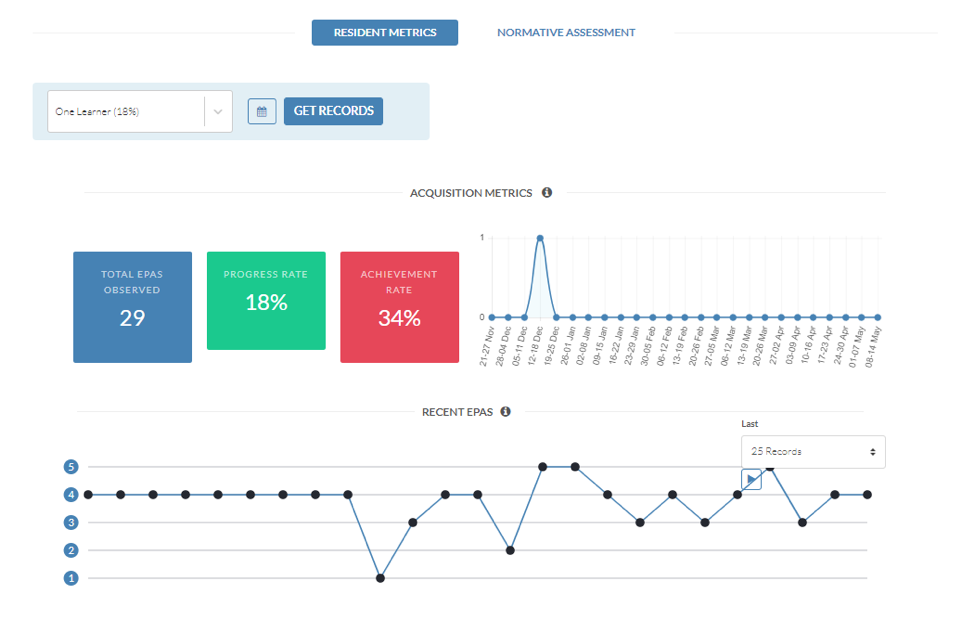
To the right of the acquisition metrics is a line chart that shows the weekly EPA acquisition rate for the last six months by the resident. This is meant to give a high-level overview at a quick glance of the residents assessment gathering rate in the recent past.
2. Recent EPA’s
This section is meant to quickly lookup a residents’ recent performance with the option to view records in the following ranges: last 10 days, last 25 days, last month and last 3 months. The chart does not visually distinguish the different EPA types (i.e., EPA-F1 vs EPA-C2), instead, it provides this and other additional information in a pop-up menu that can be invoked by hovering the mouse over a point. Please note that currently, the pop-up menu appears a little far from the actual point on the chart. We hope to have this fixed soon.
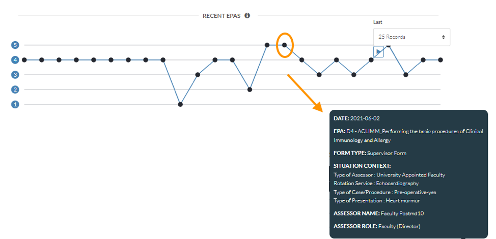
The line chart provides a simple representation of the last “N” assessments filled by the resident where every EPA is represented as a point with the oldest record starting on the left. The points are arranged vertically using the Overall Entrustability scale with 5 being the highest (I did not need to be there) and 1 being the lowest (I had to do). The better a resident performs in an EPA, the higher is the vertical position of the point in the chart.
3. Individual EPA Assessments
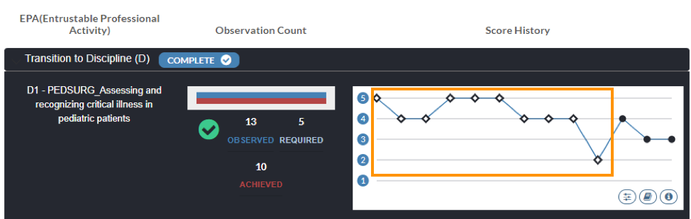
The final section provides a detailed overview of every single EPA completed by the resident. The entire list of EPAs that residents are required to complete are broken down into four groups based on the training phase during which a resident is supposed to complete them and are numbered accordingly.
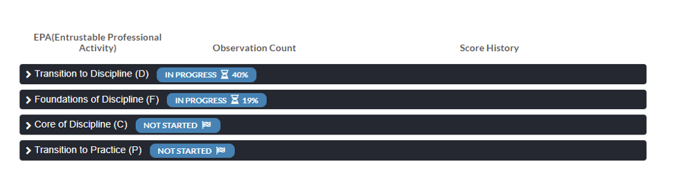
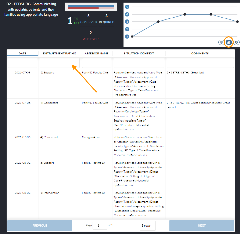
Each training phase is presented as a block with the title of the training phase and a label indicating whether or not the resident has completed the training phase. If a training phase is in progress a completion rate is shown to indicate the number of assessments the resident has achieved in that particular training phase relative to the total number of required assessments for every EPA in that phase. Each training phase block can be expanded or collapsed to view the list of all EPAs in that block. When a training block is open, all the EPAs in that block are arranged sequentially based on the numbering order in a 3 column layout as shown in the following figure.
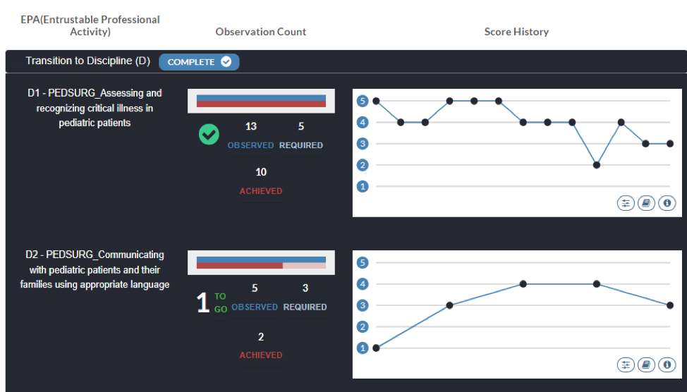

Each point in this chart can be hovered upon to view additional information about that EPA such as narrative feedback in an onscreen popup window.
Finally, two buttons are provided as seen in the bottom left corner of the chart. The first one (book icon) can be clicked to see all the records in a table that can be sorted and filtered by columns. To filter the table start typing in the input box at the top of each column in the table. This will dynamically filter the table as you type. To sort the table by a column simply click on the column header.
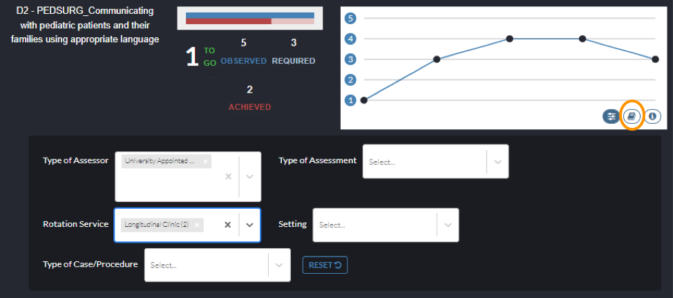
The second button (sliders icon) brings up dropdown filter lists that can be used to visually identify a particular record based on patient demographics or other contextual variables such as “Case Complexity” or “Clinical Presentation”. For example, if a user wanted to see which of the records were for senior patients, they could select the ‘Senior’ option from the drop-down list and the corresponding points (observation scores) would turn light red.
4. Date Filtering
This is a common feature across the dashboard that highlights all assessments that were filled in particular time period. To enable this, head over the filter panel at the top of the dashboard and click on the small button with the calendar icon on it. This will open up a panel where you can set the start date and end date for the time period. You can either type in directly into the input box or use the date selector on the calendar below.
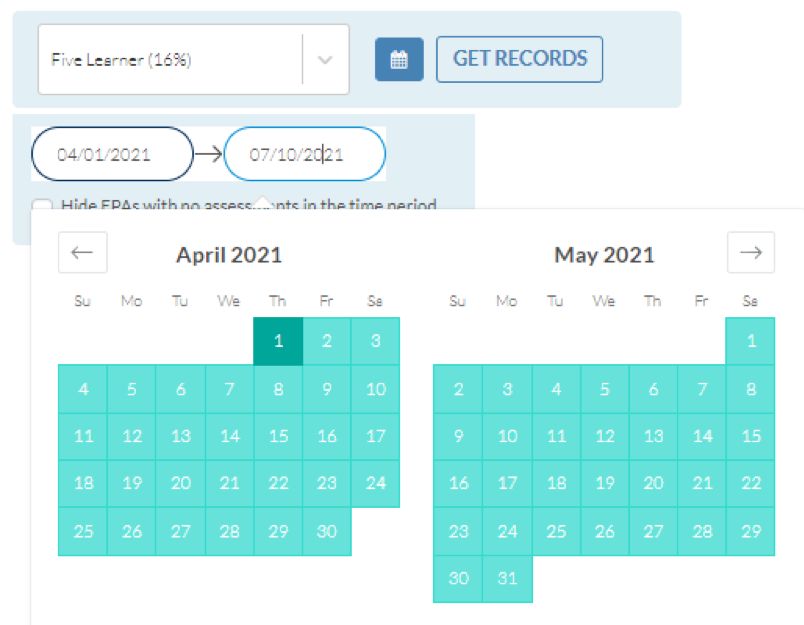
Once the start date and end date are set all assessments that fall in that particular time period are converted into diamonds across the dashboard. This provides a way to visually distinguish these EPAs while still viewing them relative to other EPAs filled outside of the selected time period.
This feature can be particularly useful during competence committee meetings such that the time period can be set to highlight only the EPAs filled by the resident since the last meeting.
If you have any questions or require further assistance, please do not hesitate to contact the Elentra Help Desk.